TIEImageEnGlobalSettings.EnableTheming
Declaration
property EnableTheming: boolean;Description
When enabled, VCL Themed colors will be used for ImageEn visual controls.Affected TImageEnView Properties
- Background
- GradientEndColor
- RulerParams.Color
- RulerParams.Font.Color
- RulerParams.GripColorDefault
- RulerParams.GripPenColor
- RulerParams.MeasureColor
Affected TImageEnMView/TImageEnFolderMView/TImageEnLayerMView Properties
- Background
- GradientEndColor
- TopTextFont.Color
- InfoTextFont.Color
- BottomTextFont.Color
- TextBackgroundColor
- SelectedFontColor
- SelectionColor
- ThumbnailsBackground
- ThumbnailsBackgroundSelected
- ThumbnailsBorderColor
Other Affected Properties
- PreviewImageBackgroundColor
- RulerColor
- GripColorDefault
- GripPenColor
Note: Only system colors will be themed, e.g. clWindow, clWindowText, clBtnFace, clGrayText, etc. Controls with fixed colors such as clBlue, clBlack, $$00FCFCFC will not be themed.
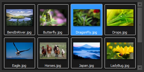
A themed TImageEnMView:
A themed TImageEnViewToolbar:

Default: True (VCL theme colors are used if theming is enabled)
Demo
 | Demos\Other\ImageEn_Theming\VclStylesDemo.dpr |
Examples
// Disable VCL theme colors in ImageEnIEGlobalSettings().EnableTheming := False;
ImageEnView1.Update();
ImageEnMView1.Update();
// Compare the following...
IEGlobalSettings().EnableTheming := True;
ImageEnView1.Background := clBtnFace; // Background will be a themed color
ImageEnView1.Background := clBlue; // Background will be blue
IEGlobalSettings().EnableTheming := False;
ImageEnView1.Background := clBtnFace; // Background will be clBtnFace (gray)
ImageEnView1.Background := clBlue; // Background will be blue